London is often characterised as a city of wealth and opportunity, yet it is also home to some of the most deprived neighbourhoods in England. The English Indices of Deprivation 2025 (IoD2025) reveal a complex picture: deprivation is widespread, intensely concentrated in certain areas and increasingly shaped by shifting housing pressures and demographic change.
Rather than being confined to one part of the capital, deprivation in London takes multiple forms, including both boroughs where disadvantage is evenly spread and boroughs with pockets of acute deprivation. Understanding these patterns is essential for targeting resources effectively and responding to emerging needs.
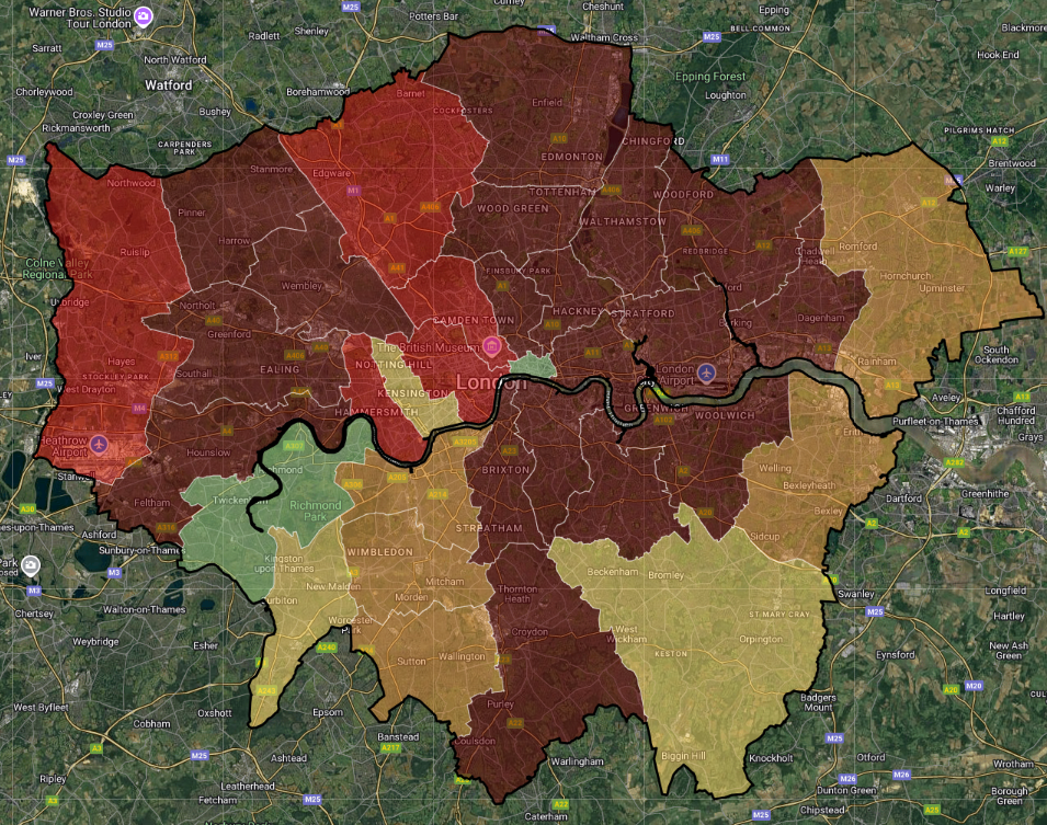
A key feature of the deprivation data is that the “most deprived borough” depends on the summary measure used. The Index of Multiple Deprivation (IMD) provides several complementary measures designed to capture different aspects of deprivation:
A different picture emerges depending on the lens applied:
Notably, Hackney is the only borough that appears in the top five across all five measures, underlining its persistent and multi-dimensional disadvantage.
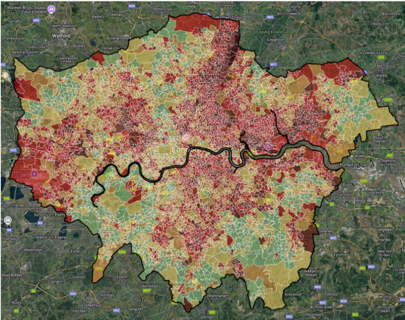
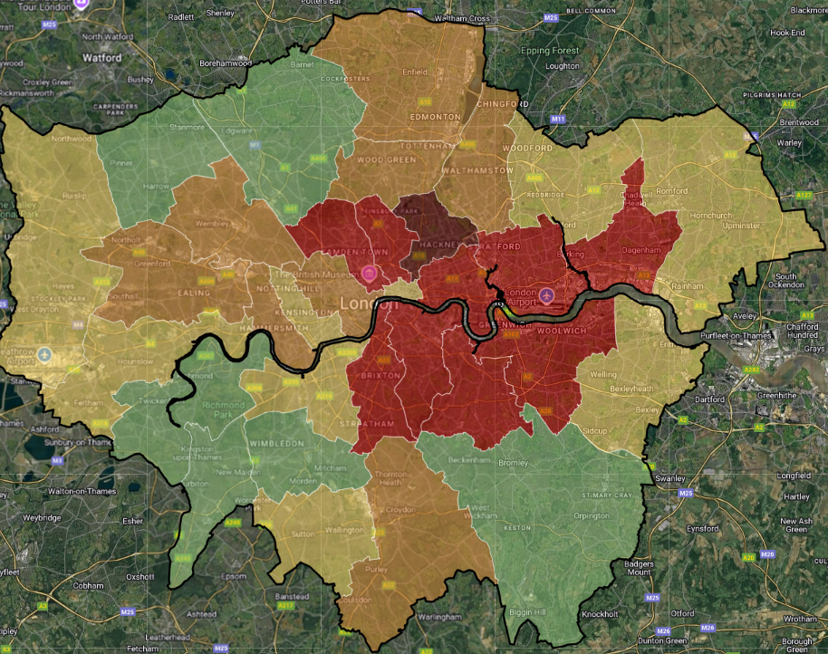
Because the IMD is designed to capture deprivation at neighbourhood level, the London-wide map reveals patterns that borough averages can obscure.
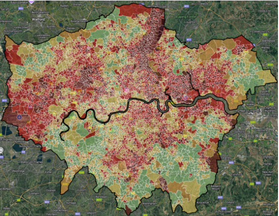
The 2025 IMD ranks show clear clusters of highly deprived neighbourhoods, particularly:
By contrast, deprivation is generally lower across much of suburban Outer London, particularly in large parts of the south-west and outer south.
Explore the 2025 IMD rank on an interactive map
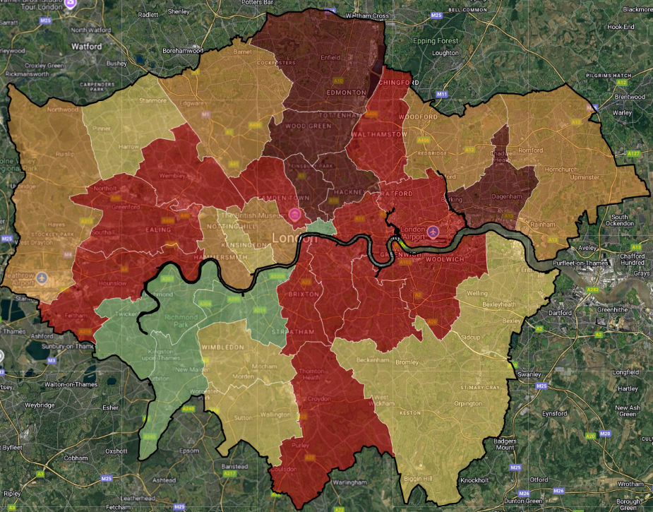
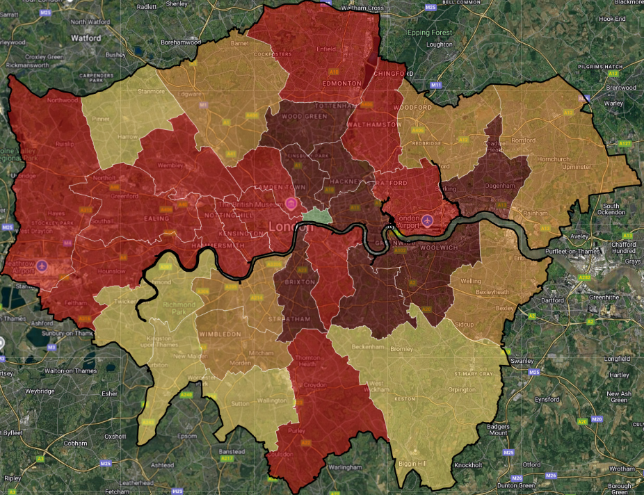
Comparisons between the 2019 and 2025 maps suggest London’s deprivation geography may be shifting.
There is evidence of deprivation becoming more visible in parts of Outer London, particularly:
At the same time, some areas closer to the Thames in Inner London appear relatively less deprived than they were in 2019.
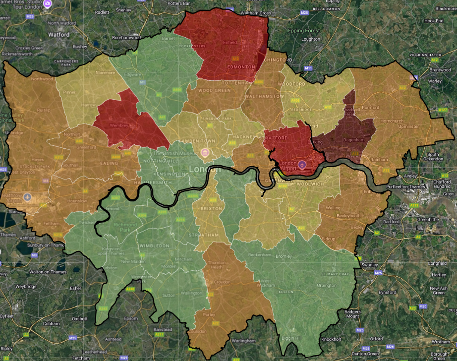
The most deprived 10 LSOAs in London are located predominantly outside central areas.
Four of the ten most deprived neighbourhoods are in Brent, including the most deprived LSOA in London: St Raphael’s, near Neasden Station.
Haringey and Enfield also contain multiple neighbourhoods in the top ten.
| Rank | LSOA code | LSOA name | Local Authority District name | IMD Rank |
|---|---|---|---|---|
| 1 | E01000601 | St Raphaels 021B | Brent | 238 |
| 2 | E01001178 | University Hospital & Queen's Road 015D | Croydon | 284 |
| 3 | E01003318 | Catford Bridge 020B | Lewisham | 454 |
| 4 | E01002036 | Northumberland Park 002A | Haringey | 565 |
| 5 | E01033455 | Harlesden 031G | Brent | 576 |
| 6 | E01000521 | Church End 025B | Brent | 721 |
| 7 | E01000524 | Harlesden 031B | Brent | 799 |
| 8 | E01001461 | Haslebury South 027D | Enfield | 835 |
| 9 | E01002038 | White Hart Lane 037B | Haringey | 879 |
| 10 | E01001429 | Edmonton Green 030D | Enfield | 888 |
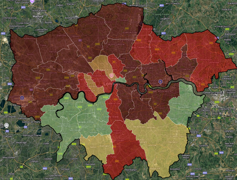
Income deprivation remains one of the most significant challenges across London.
Explore the Income domain with interactive maps
Employment deprivation is notably less widespread.
Explore the Employment domain with interactive maps
London stands out as relatively less deprived on the Education, Skills and Training domain compared to other IoD domains.
This likely reflects the capital’s highly skilled population and the relatively high performing schools.
Explore the Education, Skills and Training domain with interactive maps
The Health Deprivation and Disability domain highlights continuing health inequalities.
Explore the Health Deprivation and Disability domain with interactive maps
Crime deprivation is relatively widespread across London, with Inner East London most notably affected.
Hackney again ranks as the most deprived borough on this measure, showing overlapping challenges across multiple domains.
Explore the Crime domain with interactive maps
One of the most distinctive London patterns is deprivation related to housing affordability and access, reflecting the housing pressures facing much of the city.
Explore the Barriers to Housing and Services domain with interactive maps
London performs worse on the Living Environment domain than any other facet of deprivation.
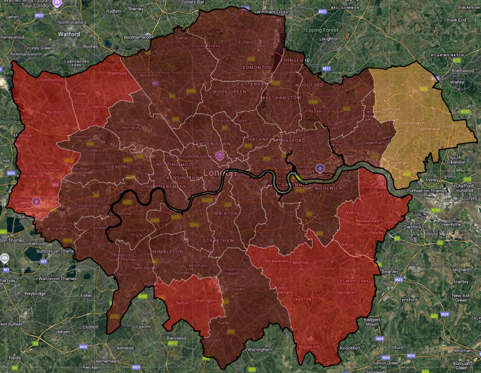
This reflects outdoor factors such as air pollution, noise and traffic accidents, alongside indoor issues like overcrowding and lack of private outdoor space.
Explore the Living Environment domain with interactive maps
As the team that developed the English Indices of Deprivation on behalf of government in 2015, 2019 and 2025 we have plenty of experience in helping organisations make sense of the data:
Explore IoD 2025 data instantly for any area, alongside 1,600+ datasets. Create and share interactive maps, dashboards and reports with ease.
Want to join our community of 5000+ users? Book a demo with one of our team today.
Get an instant IoD 2025 report for your chosen Local Authority or constituency, with benchmarks, domain insights and trends over time.
View a sample report and buy your report now.
Need something tailored? Our consultancy offers flexible geographies, expanded indicators and expert interpretation.
Talk to our team to discuss your needs.

The English Community Needs Index (CNI) 2023 is now published as open…
More
Social housing providers have deep, experience-based knowledge of the communities they serve….
More
Many funding programmes use the Index of Multiple Deprivation (IMD) to identify…
More