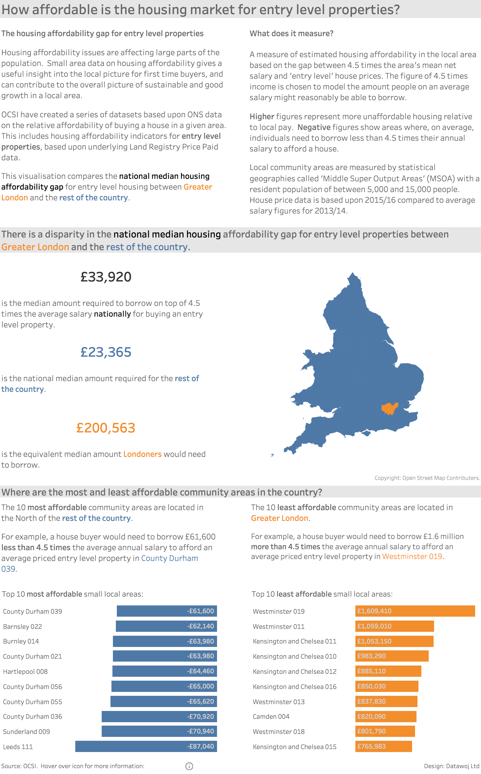
Back in April we blogged about some new data on housing affordability. These were a series of datasets based upon ONS data on the relative affordability of buying a house in a given area. This includes housing affordability indicators for entry level properties, based upon underlying Land Registry Price Paid data. For more information, take a look at the original post.
We are delighted to have Colin Wojtowycz of Datawoj Ltd guest blogging for us, and sharing some insights into using data visualisation to tell an engaging story. In a two part series, he will explore how the right data, tools and techniques can provide quick and accurate insights that help balance demand for insight now and in the future.
One challenge that local government intelligence teams face is providing timely and effective insight and intelligence to help policy-makers make informed decisions about what services are likely to be needed locally in the future. However, it is difficult to balance service delivery now with the future in a time of resource prioritisation across the public sector.
Innovative approaches are required to help solve complex problems through efficient delivery of insight.
Data visualisation can help make research findings more visible and engaging to decision makers, enhancing the value of insight as it leads to business intelligence. Tools like OCSI’s Local Insight provide up to date local level information which reduces the need to manually source facts and figures. And open source data visualisation tools like Tableau Public allows for collaborative intelligence across local partnerships.
However, just as good data visualisation can lead to quick and accurate paths to insight, so bad visualisation can also lead to a misinterpretation of information. A good grounding in data visualisation knowledge through theory and practice is required. The real challenge though is to act on the insight delivered to ensure an effective housing affordability policy is in place locally to ensure adequate supply meets demand.
OCSI’s tool Local Insight provides up to date data at a very local level. Multiple data sets can be placed into a wider context with instant access to over 700 other local level, open datasets. Data can be matched to communities, visualised on maps, dashboards and reports to enable deep dives into data through exploration.

Using data available in Local Insight, I combined the local area housing affordability data with data visualisation software; Tableau Desktop to explore housing affordability trends in depth. Tableau Desktop’s spatial connector allows datasets with an area code to be quickly combined with a spatial file of the same area type. In this case; I connected housing affordability data for community sized areas called ‘Middle Layer Super Output Areas (MSOAs have an average resident population of between 5,000 and 15,000 people)’ to a spatial file available openly from the Ordnance Survey.
The interactive dashboard is available on the Datawoj Tableau Public Page and there is a static version below:
Once connected measures were ‘dragged and dropped’ onto the view to explore the data and create bespoke charts and maps. These were combined onto a dashboard, which allows for context, charts and analysis to be developed into an engaging narrative.
The goal was to highlight key insights within a story based narrative which aims to guide the user through the analysis. Some of the techniques used to aid this include:
This visualisation compares the national median housing affordability gap for entry level housing between Greater London and the rest of the country. The median amount is used to reduce the effect of outliers upon the average housing affordability gap.
In part two of this blog series we will explore rural housing affordability issues. We will look at the housing affordability gap for average priced houses at the very small area. This will include some data mapping and distribution techniques.
Datawo j Ltd. is an independent consultancy specialising in data visualisation for social research and business intelligence. It draws upon 18 years in Local Government specialising in socio-economic research and public consultation. To find out more get in touch on colin@datawoj.co.uk or visit https://datawoj.co.uk/

Many funding programmes use the Index of Multiple Deprivation (IMD) to identify…
More
The results of the May 2026 local elections provided plenty to reflect…
More
Local data and evidence on community needs, demographics and outcomes to support…
More