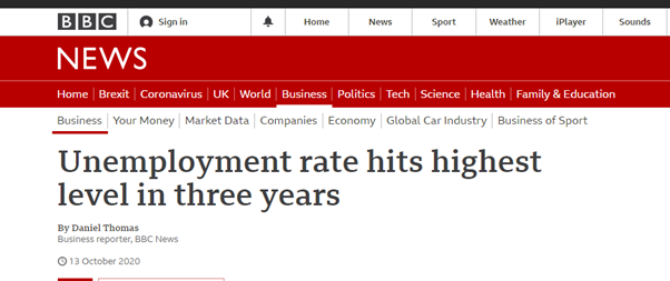
During 2020 shocking unemployment statistics hit the headlines. This includes the largest single monthly increase in recorded unemployment – 850,000 new claimants across the UK (equal to an increase of 66%) between March and April. This resource takes a look at the data behind the headlines. We explore the origins of unemployment data and what it can and can’t be used for.
Neighbourhood level unemployment data is available in our tool, Local Insight (alongside more than 1,000 other indicators). If you would like to find out more about unemployment in your service patch, sign up for a free demo.
The definition of unemployment is those people without a job who have been actively seeking work within the last four weeks and are available to start work within the next two weeks.
When we look at the unemployment rate, this is not based upon the proportion of the total population. Instead, it is the proportion of the economically active population.
The economically active population – sometimes referred to as the labour force, refers to those currently in work plus those seeking and available to work.
This means those that are economically inactive are excluded from these figures entirely. For example, people who are neither in employment nor unemployed, such as those looking after a home and family, long- or short-term sick, injured or disabled people, or those who are retired.
National unemployment figures in the headlines.
National unemployment figures are based on a self-reported, national survey called the ‘Labour Force Survey’ that the Office for National Statistics publishes. These are the official, national unemployment statistics.
The ONS collects and publishes data on a monthly basis. There is a two-month time lag between when the publication date and the timepoint it refers to. For example, a January release will cover unemployment up to the previous November.
The data also refers to the unemployment rate over a three month period. So in the example above, the figure will be for unemployment from September to November.
Local unemployment figures in the headlines
The Department of Work and Pensions publishes more granular data on unemployment.
The Jobseeker’s Allowance (JSA) & Universal Credit indicator gives the most comprehensive figures at a local level on those that are currently unemployed. You may also see this referred to simply as the ‘claimant count’. This figure is a combination of JSA claimants and a subset of Universal Credit claimants, which covers those that are required to seek work and be available for work.
Whereas the national figures use a self-reported survey, this data is administrative data. Administrative data is data that has been collected by government for other non-statistical reasons. In this case, the JSA & Universal Credit indicator is a record of who is currently in receipt of unemployment benefits.
As well as the overall ‘claimant count’ – this data is also available for different subsets of the population. For example, youth unemployment and other age and gender breakdowns.
The Universal Credit rollout has also caused some additional challenges in interpreting unemployment figures.
Universal Credit is a combined benefit payment for those in and out of work. It replaces some of the benefits that until recently were individual benefits. For example, housing benefit, child tax credit, income support, jobseekers allowance and working tax credits.
The full-service roll out was completed in 2018. However, the managed migration of existing benefit claimants was delayed by the pandemic and is not yet complete. It is largely the long-term unemployed that still receive JSA payments.
The total number of people still in receipt of Jobseekers Allowance is in fact quite low. Currently 264,000 of just under 2.25 million unemployment benefit claimants are in receipt of JSA – around 11% of claimants.
The different aspects of Universal Credit are broken down into different ‘conditionality regimes’. The ‘Searching for Work’ group relates to unemployment. Unfortunately, this does not overlap perfectly with JSA.
The ‘Searching for Work’ group also includes those that have not previously been eligible for JSA, such as:
This has led to some challenges in accurately being able to measure change over time. This now includes an extra group of people. There also isn’t any way of distinguishing between the different groups.
New claimants are automatically assigned to Universal Credit. However, different places have a different approach to migrating those on ‘legacy benefits’ (in this case JSA) to the new Universal Credit system. So, areas with a higher rollout may show falsely higher figures.
Turn2Us have an excellent guide on the timetable for benefit changes over the years.
The pandemic has thrown up some additional challenges for interpretation.
There was (and continues to be) a huge surge in the number of Universal Credit applications in the wake of mass redundancies. Applying to Universal Credit involves the individual making their claim, somebody assessing the claim and then assigning the applicant their ‘conditions.’
The condition relating to unemployment is the ‘Searching for Work’ group. However, the huge surge in numbers has meant that assessments haven’t been as thorough. There is evidence that this has led to some incorrect classifications – for example, individuals being added to the ‘Searching for Work’ group, rather than the ‘No Work Requirements’ group. This group covers those people that are not expected to enter the labour market, due to health reasons, for example.
Some furloughed groups are also getting rolled into the Universal Credit figures as well as the figures for the Coronavirus Job Retention Scheme. Lack of contact with work coaches during the lockdown and a backlog of cases has meant that the conditionality statuses have not been updated as quickly as prior to the pandemic. Some individuals who made an application for UC before the Furloughing scheme was in place have been double-counted.

The English Community Needs Index (CNI) 2023 is now published as open…
More
Social housing providers have deep, experience-based knowledge of the communities they serve….
More
Many funding programmes use the Index of Multiple Deprivation (IMD) to identify…
More